A website can look beautiful and still frustrate everyone who uses it. Looks are surface; the experience is whether people can actually do what they came to do — find the page, fill the form, complete the purchase — without friction or confusion. That is the job of UX and UI design. When it is done well, visitors barely notice it; they just glide through and get what they wanted. When it is done badly, they notice every snag, and many of them leave.
The takeaway up front: usability comes from removing friction, not adding cleverness. Map the path a real person takes to their goal, make navigation obvious, design every state and not just the happy one, and make the whole thing usable for everyone. Polish is the small interaction details on top of those fundamentals — and small details make a big impression.
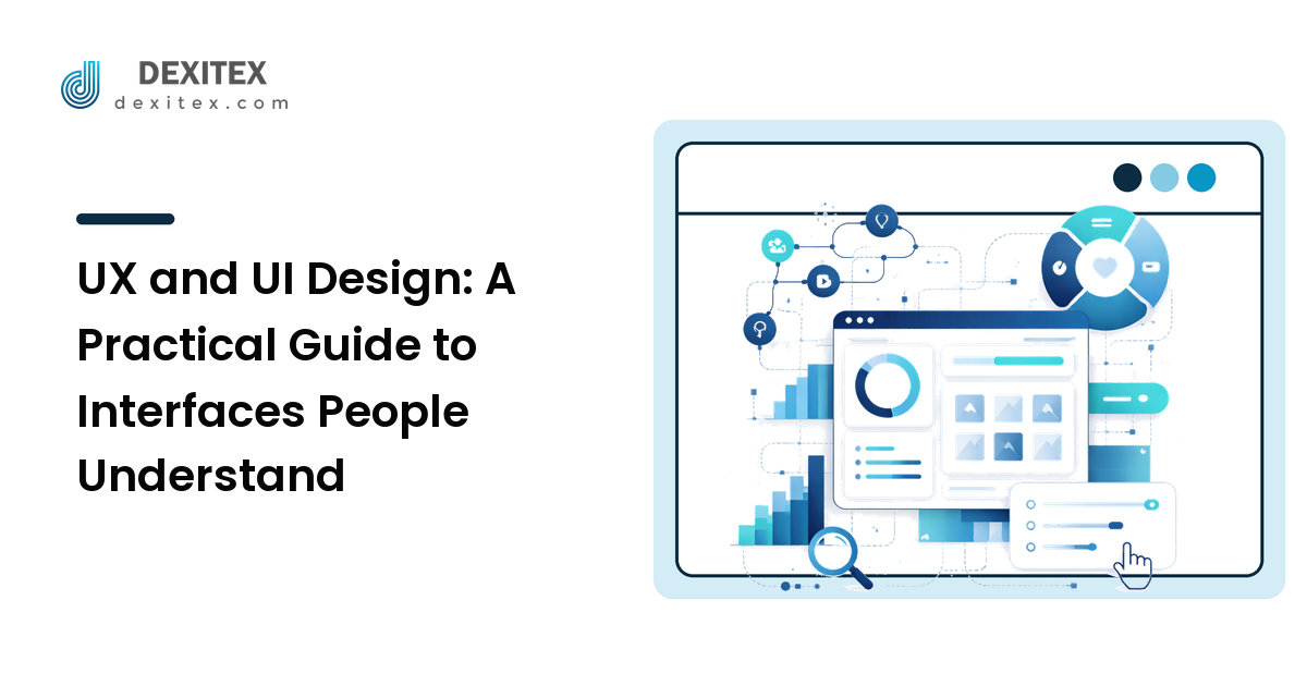
UX vs UI: what's the difference, and why it matters
The terms get used interchangeably, but they describe different work, and conflating them leads to pretty interfaces that do not work.
UX (user experience) is the structure and flow: what the user is trying to accomplish, the steps they take, how information is organized, and whether the path makes sense. It is mostly invisible when it is right.
UI (user interface) is the visible layer they touch: buttons, menus, forms, spacing, color, and type. It is how the experience is presented and operated.
A simple way to hold the distinction: UX decides what goes where and why; UI decides how it looks and behaves. You need both, and they have to agree. A gorgeous interface laid over a confusing flow is lipstick on a maze. If you have not yet settled the visual foundations — hierarchy, type, color, and spacing — start with our web design guide, because clean UI is what makes good UX legible.
Start with the user's goal, not the page
Good UX begins by being clear about what people actually come to do. Visitors do not arrive wanting to "browse your website"; they arrive to accomplish a task — compare options, get a quote, book a slot, find an answer. Name your top two or three of these tasks before you design anything, because every layout decision should make those tasks easier.
This reframes design from "what do we want to show?" to "what is the visitor trying to finish, and what is in their way?" The second question is the one that produces usable interfaces.
Map the user flow before the visuals
A user flow is the sequence of steps someone takes to complete a task, from entry to done. Sketching it — even as a rough list of steps — surfaces friction before you have spent time on visuals that may need to change anyway.
For each step, ask three questions:
- What does the user need to know here to move forward? Missing information is the most common reason people stall.
- What might make them hesitate or worry? Unexpected costs, vague labels, or a sign-up wall before they see value.
- What is the single next action? Every screen should make the next step obvious.
The aim is the fewest, clearest steps that get the job done. Each extra step, field, or decision is a place to lose someone, so cut anything that does not earn its keep. Fewer, clearer steps almost always beat more, cleverer ones.
Make navigation obvious
Navigation is how people answer three quiet questions: where am I, where can I go, and how do I get back? If your interface answers those instantly, it feels effortless; if it does not, it feels like a maze regardless of how nice it looks.
A few reliable principles, each with a reason:
- Use plain, descriptive labels. "Pricing" beats a clever invented word, because navigation is not the place for personality — it is the place for certainty.
- Keep the primary menu short. A handful of clear top-level choices is easier to scan than a long list; group the rest underneath logically.
- Show people where they are. Highlighting the current section and using clear page titles keeps visitors oriented.
- Make the logo return home. It is a near-universal convention, and following conventions is what lets people use your site without learning it.
Conventions matter more than originality in navigation. People bring habits from thousands of other sites; meeting those habits is a feature, not a lack of imagination.
Design every state, not just the perfect one
Inexperienced design covers the "happy path" — the screen as it looks when everything goes right and the data is ideal. Real users hit the other states constantly, and how you handle them is much of what separates a polished interface from a fragile one.
Design these deliberately:
- Empty states — what a screen shows before there is any content. A good empty state guides the next action instead of looking broken.
- Loading states — clear feedback that something is happening, so people do not assume it froze and give up.
- Error states — messages that say what went wrong and how to fix it, in plain language, placed next to the problem. "Something went wrong" helps no one.
- Success states — clear confirmation that an action worked, so people are not left wondering.
Forms deserve special care here, because they are where users do the real work and where they most often abandon. Label fields clearly above the field, ask for as little as possible, validate gently and explain errors in context, and never make people guess why a submission was rejected.
Design for everyone: accessibility
Accessibility means building interfaces people can use regardless of how they see, hear, move, or navigate — including those using a keyboard or a screen reader. It is the right thing to do, it is widely a legal expectation, and in practice it makes the interface better for everyone, not only people with disabilities. Captions help in noisy rooms; strong contrast helps in bright sunlight; clear focus states help anyone moving fast.
The high-impact basics, each for a concrete reason:
- Sufficient color contrast between text and background, so it is readable in real conditions and by people with low vision. Aim to meet WCAG AA.
- Keyboard operability — everything clickable should be reachable and usable with a keyboard, with a visible focus outline, because not everyone uses a mouse.
- Real labels and alt text — form fields need proper labels and meaningful images need alt text, so screen readers can convey them.
- Don't rely on color alone to signal meaning, since not everyone perceives it; pair it with text or an icon.
Accessibility is not a separate project bolted on at the end. Built in from the start, it costs little and lifts the quality of the whole interface.
Sweat the interaction details
This is where competent becomes delightful, and it is mostly inexpensive:
- Make tap targets big enough on touch screens, so people are not mis-tapping tiny links.
- Give instant feedback on interaction — a button that visibly responds reassures people the click registered.
- Keep things consistent. The same action should look and behave the same way everywhere, so people learn your interface once.
- Respect attention. Avoid intrusive pop-ups that block the task; an interruption at the wrong moment is a fast way to lose someone.
And a line worth holding to: never use dark patterns — designs that trick people into actions they did not intend, like a hidden unsubscribe or a pre-ticked upsell. They might lift a metric briefly, but they erode the trust that brings people back, which costs far more than it earns.
A quick UX and UI checklist
- Goal first — know the top tasks people come to complete.
- Flow — map the steps and cut every one that does not earn its place.
- Navigation — plain labels, short menu, clear "you are here," conventional patterns.
- States — design empty, loading, error, and success, not just the happy path.
- Forms — minimal fields, clear labels, gentle in-context validation.
- Accessibility — contrast, keyboard use, labels and alt text, never color alone.
- Details — big tap targets, instant feedback, consistency, no dark patterns.
Work top to bottom; the flow and navigation work has the biggest payoff.
FAQ
What's the difference between UX and UI design?
UX is the structure and flow — what the user is trying to do and the steps to get there — and is mostly invisible when it works. UI is the visible layer they interact with: buttons, menus, type, color, and spacing. You need both, and they must agree, because a beautiful interface over a confusing flow still frustrates people.
How do I improve UX without a full redesign?
Start with one important task, walk through it as a first-time visitor, and fix the first place you hesitate or get confused. Most usability wins come from removing steps, clarifying labels, and handling error and empty states — none of which require rebuilding the site. Small, targeted fixes to the main flows usually move the needle more than a redesign.
Why does accessibility matter for my website?
Accessibility lets more people use your site regardless of how they see, hear, or navigate, it is widely a legal expectation, and it improves the experience for everyone — strong contrast and clear focus states help all users, not only those with disabilities. Built in from the start it costs little and raises overall quality, whereas retrofitting it later is harder and more expensive.
What are dark patterns and why should I avoid them?
Dark patterns are interface tricks that nudge people into things they did not intend — hidden cancel buttons, pre-ticked add-ons, confusing wording. They may lift a short-term metric, but they damage trust and reputation, which costs far more over time. Designing honestly keeps customers coming back, which is the outcome that actually compounds.
How many items should a navigation menu have?
Keep the primary menu short — a handful of clear, top-level choices people can scan at a glance — and group everything else logically beneath them. The exact number depends on your site, but the principle is that a shorter, well-organized menu is easier to use than a long flat list, because it reduces how much the visitor has to read and weigh.
Next step
Usable design is mostly the discipline of removing friction and handling the cases other people skip. This week, pick your single most important user task, walk through it as if you had never seen the site, and fix the first point where you hesitate. Then check it works by keyboard and reads clearly at a glance. When you are ready to take the whole experience further, that detail work is what we do every day at Dexitex.